This brand needed taking from its modest blog into a more professional, commercially viable form, without leaving its roots behind. Archer and Archer was more country attire than street style so this was abbreviated to A + A. The angular and symmetrical shape of the letter ‘A’ created the logo and graphic. Font - Miso


This annual report for a consumer electronics company, with no imagery provided, needed a strong graphic element. It had to appeal to financial professionals whilst retaining a positive, cheerful and clean feel. The idea of unity was adapted by using half and quarter circles. Fonts- Hoefler/Avenir Next


Priorat is a wine with a cult-like following. The Priorat soils have a high quartzite content which causes it to glisten in the sun. This inspired the name ‘OR’ (catalan for 'treasure'). The hand painted sloping lines represent the steep hills of Catalonia. Fonts - Mr Eaves San Ot/Palatino Roman/Valentina.


The design of this magazine needed a different take on biking culture. ‘Cks’ on on Tracks was replaced with ‘x’. Angled lines were formed to give the illusion of a treadmark. Road-trip style iconography was also used. Fonts - Museo/LeCorbusier


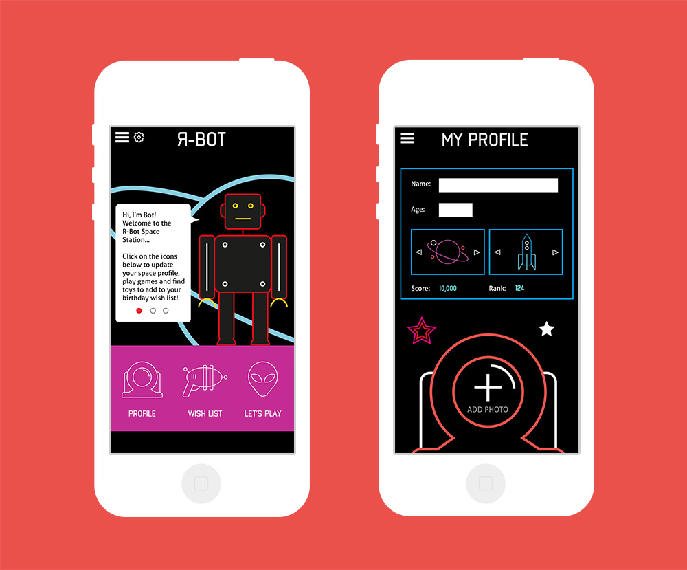
Toys R Us wanted to put on an event to reinvent their old-fashioned and now tired brand. This was achieved with a futuristic themed event, a bold statement to bring Toys R Us back to the cutting edge of technology and gaming. An app was launched alongside the event. Space-age iconography was used to create a graphic image. Fonts - Neutraliser/Aller


This telecoms brand is aimed at teenagers who desire cheap sims for data and calls. The name stemmed from the idea of generation Z - tech savvy, fashionable, music lovers. A logo, slogan and sub brand was created. It needed to be cool, strong, attractive and unlike any of the other networks. Fonts - Stratum1.


Chem&co are a multi-national pharma company wanting to produce a sophisticated and innovative report. This had to appeal to investors and government bodies. The square globe motif touched on the idea that the world was once thought of as flat. This reminded investors to think differently, or 'outside of the box', and join a forward thinking company. Fonts - Seravek/Athelas


Market leader Pantone released their new range of Universe Colours, aimed at creative people. The advertising postcard had to be striking, modern, and inspiring. It had to be aesthetically pleasing; something to frame. Fonts - Avant Garde Gothic

